sayhello@brightbrightgreat.com
+1 (773) 647-1034
Independent Since 2008
Nav
Start a project
Works
Agency
Contact
WORKS
AGENCY
NEWS
CONTACT
CAREERS
SHHHH
PRIVACY POLICY
UI
Back to all
May—22—2023
X Co. — Strategy, UX & Product
Feb—15—2018
New Work: Celebrating 100 Years of Color with Rit Dye
Jan—30—2018
New Work: The Landing Hotel, Rivers Casino Hotel Experience
May—18—2017
New Work: Hologram, an IoT Company
May—5—2017
New Work: Strata, a Comcast Company
Feb—14—2017
InterOptic by Advantage Optics
Nov—28—2016
New Work: Black Spectacles 2.0
Oct—10—2016
New Work: Wright & Ditson
Oct—3—2016
New Work: Paris312
Aug—17—2016
New Work: Amanecer Yacht
Jul—13—2016
New Work: Great Lakes Home
Jun—15—2016
New Work: Bright Bright Great Launches New Brand and Website for Red Jacket
Jun—2—2016
New Work: Announcing the New Avondale Type Co Website
May—6—2016
American Needle Redesign Selected as Communication Arts Webpick
May—5—2016
New Work: Triad Process Equipment
Apr—15—2016
New Work: American Needle
Apr—8—2016
New Work: OKRP
Feb—10—2016
New Work: Geneva Trading
Nov—30—2015
New Work: HighTower Advisors Network "By Invitation Only" Campaign
Nov—10—2015
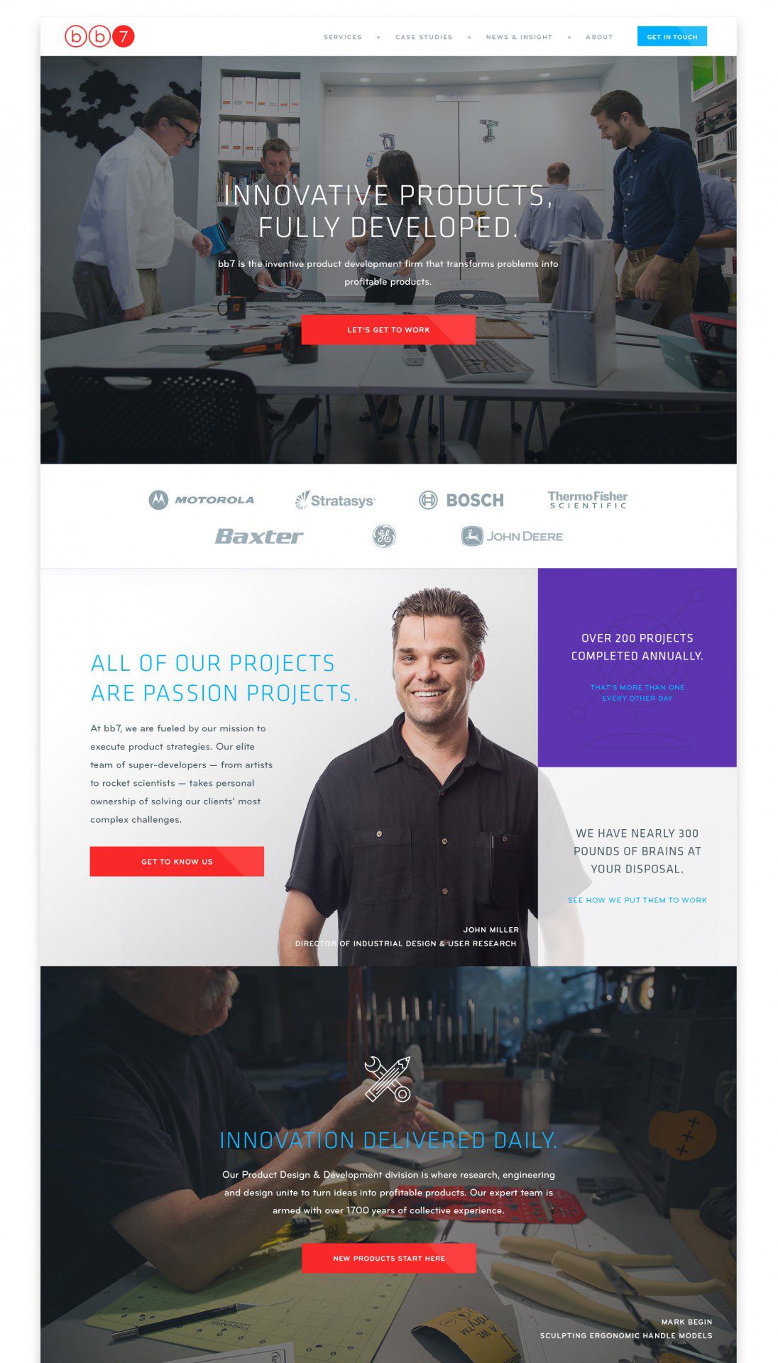
New Work: bb7
Sep—10—2015
New Work: 4C Insights Digital Brand Experience
Sep—1—2015
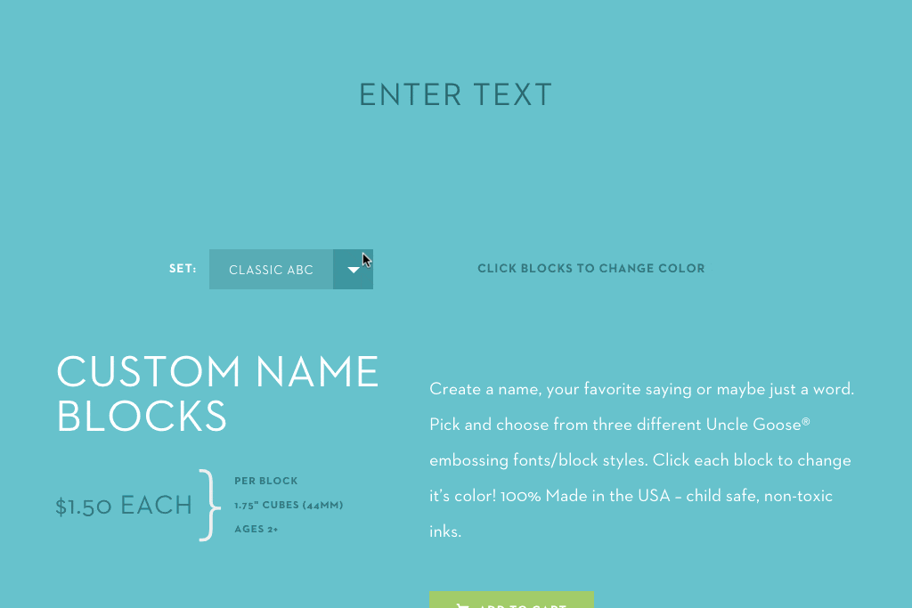
How-To: Uncle Goose Create-a-Name
Aug—12—2015
How-To: 8-Bit Hovers
Aug—11—2015
New Work: Lichter Realty
Jun—5—2015
Philo Broadcasting Becomes Philo Media
May—28—2015
Assistance League LA – Helping Those Who Help Others
Aug—1—2014
New Work: Uncle Goose 2.0 – Interactive E-Commerce Experience
Nov—15—2013
Cards Against Humanity's 12 Days of Holiday Bullshit
Sep—11—2013
Announcing Avondale Type Co., A New Font Foundry by BBG
May—28—2013
Free Download: Slate Collection of Stylized Android Samsung Galaxy S4 Retina Ready & Fully Scalable
Apr—25—2013
Bright Bright Great Featured on AIGA Member Gallery
May—8—2012
New Work: Hunter & Gatherer