Include your audience and remember less is more
Amy Schwartz
The Brand New Conference is an annual design conference that is organized by UnderConsideration, the group responsible for the popular design blog, Brand New, that critiques brand identity work. The two-day conference focuses on the forms that brand identity takes on with eight speaker-sessions per-day.
Each speaker highlights a different topic in the brand identity universe, and the speakers themselves come from a broad range of experience from large-scale creative agencies to in-house design, to smaller creative studios. For those of us in the creative agency world the chances are that our own work has been up for critique on Brand New.
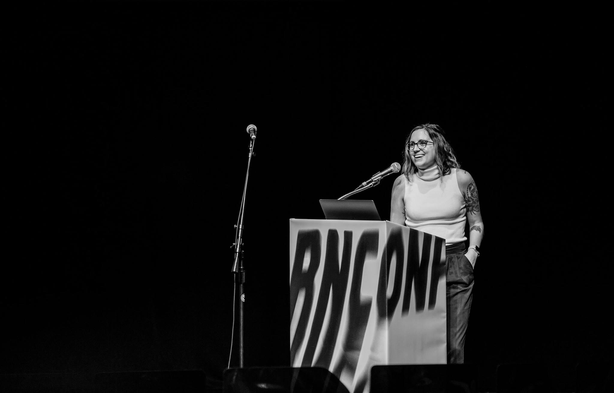
This year, the conference took place in Bright Bright Great’s hometown of Chicago at the Harris Theater in Millennium Park. We were super excited that our Creative Director, Amy Schwartz, was one of the speakers this year.
Amy focused her talk on how to tell jokes visually and how to incorporate humor as part of a brand identity. As a case study, Amy highlighted her work from Cards Against Humanity and urged designers to follow three important steps to land a joke or communicate to a client:
- Find The Thesis (and remember, less is more)
- Treat design and copy like a comedy duo (and really finesse the relationship between your elements)
- Always include your audience (because brands have a responsibility to be good to the people they care for)
Beyond that, Amy’s message was that there is power in having a brand be unapologetically who they are and to have fun in that ownership. If you have a ticket from the event, you can watch Amy’s video recap over at Brand New.
After the conference, Jeanne of Bright Bright Great sat down with Amy to ask her some questions to recap the event:
I love how your speech focused on process and how to achieve results with a framework versus just focusing on the final result of a new branding project. What advice can you give to younger designers about the brand identity process at a creative agency that they might not already know?
Being designers, we often tend to roll up our sleeves and dive into visuals right away—be it looking for inspiration, creating mood boards, or picking up a pencil or mouse. But I think it’s important to first take a step back and consider the strategy prior to any visual work.
This way, the design work isn’t in a vacuum. It is intentional and built upon the strategic framework that you created with your client. One way we do this at Bright Bright Great is to create a Brand Deck exercise. This involves having the client choose 5-10 words that resonate with their brand.
From there, we use the chosen words in different combinations to create unique visual manifestations of the brand. Exercises like this give you a strategic North Star. You know you’re heading in the right direction for the brand before you even open an Adobe program.
And when you eventually do design something gorgeous, it’s easier to explain the concept to your client and sell it to them–you’ve built a strong foundation together.
I’m always really curious about how much the conference organizations want to know about your speech ahead of time. You had to give a topic prior to the event, right? What else beyond that?
Brand New asked for a topic, description, and bio ahead of time. They also requested the slides a few days in advance which meant no last-minute fixes, which was actually a relief.
For those clients not well-versed in the creative process (but experts in other areas), how can creative folks better explain that brand identity is so much more than a logomark?
There are different levels to explaining about brand identity. I think walking clients through what to expect and showing them real-world examples is really helpful. First, you explain the visual brand, starting with color and then the why behind it, i.e. what the color stands for and why it needs to be a certain color.
Then, how color and then other brand elements like typography and imagery and layout help to shape the language and attitude of the brand. There is a reason why you don’t see the Coca-Cola logo on blue. For brands like Cards Against Humanity, their brand identity is very much built upon using humor in all of their communication and reminding people of their brand voice every step of the way.
For companies like Pepsi, that puts out a commercial (that people don’t receive well—for very good reasons)—it’s all part of a brand, with intentional choices that have an impact. Think of a brand like a person. And if you put a person in a different shirt it might look different, but it’s still the same person. Changing the visuals of a brand doesn’t erase the brand’s attitudes, communication, and other touch points.
What is one of the best things about a big design conference?
The best part is making friends. I was really excited to meet other speakers, people I was a fan of, and also have casual moments with people who attend the conference to share common ground and maybe a drink.
For those of us that didn’t go, tell us about the atmosphere at Brand New?
It was professional and high-caliber and also down-to-earth and welcoming. It was fun to talk to so many like-minded people in one space. It was big! I appreciated that there was a lot to see and it provided that one-on-one chance to interact with the design community members that might not otherwise be in Chicago.
Did you learn something new or get inspiration from the event?
Ohhhhh yeah. The whole Bright Bright Great design team left with inspiration on what type of projects we are eager to take on next year, and how we might work together to continue to evolve the Bright Bright Great Brand.
I loved Mike Reed’s talk about the importance of words in a brand. It was really great reminder for designers to always be working with copywriters.
Next year, New York?
Yes! The ’15-minute flings’ that Brand New had with local speakers were very well done and great to see. It gave me a lot of hometown pride and I look forward to seeing what other cities have to offer.


