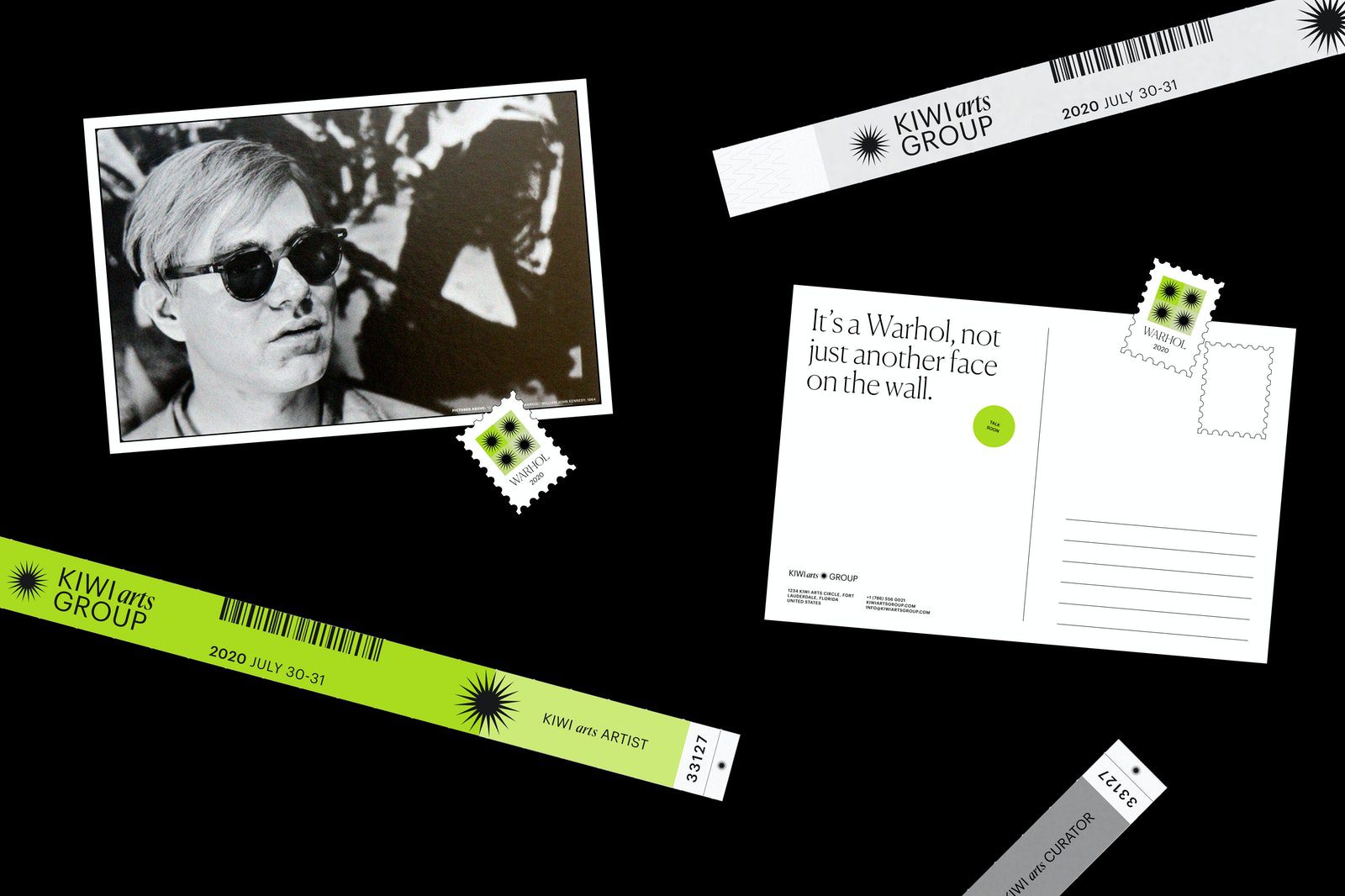
Deliverables: Strategy, Branding, Environmental, Printed Collateral, & Ephemera
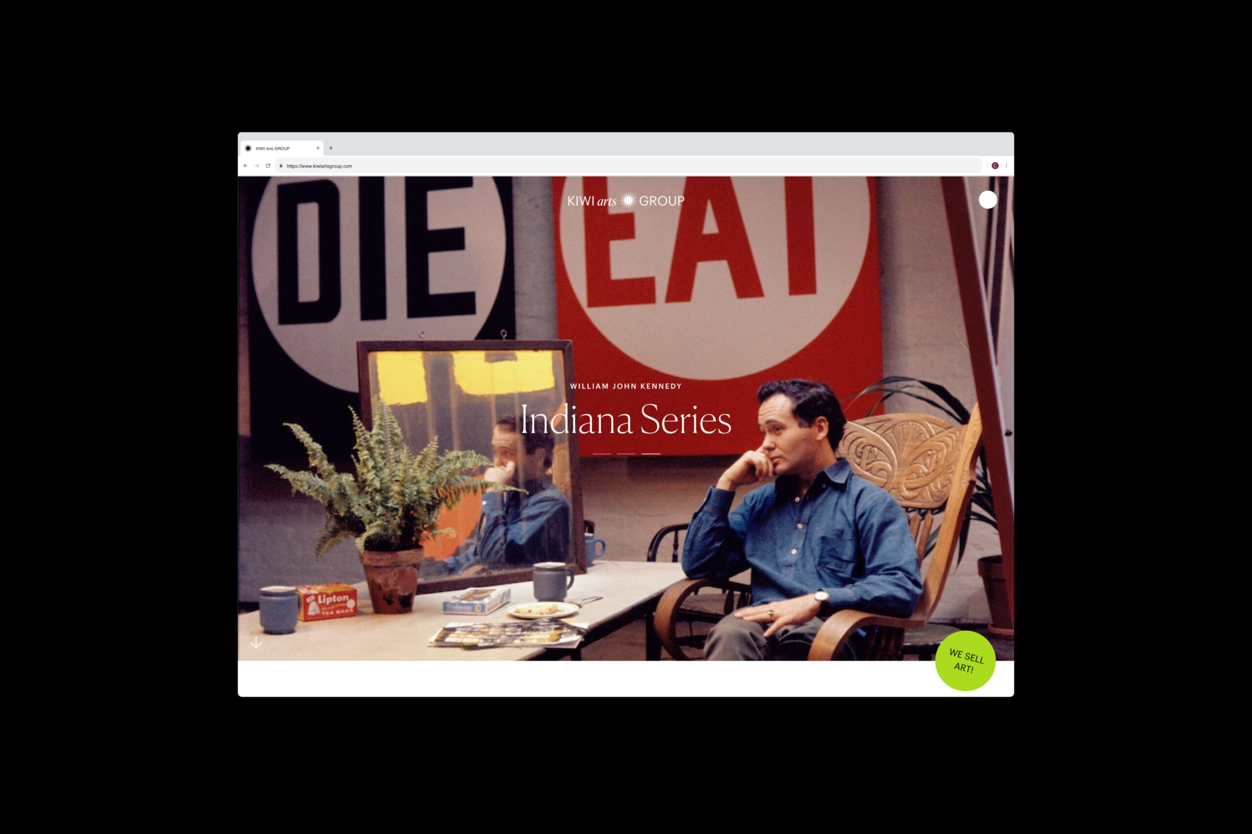
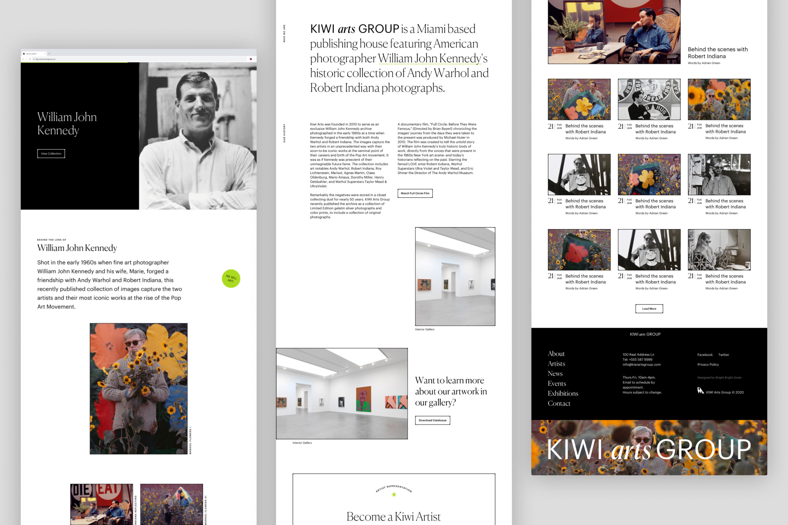
Bright Bright Great collaborates with the award-winning archive Kiwi Arts to launch a sweet new design system, priming them for expansive growth. Experience it yourself
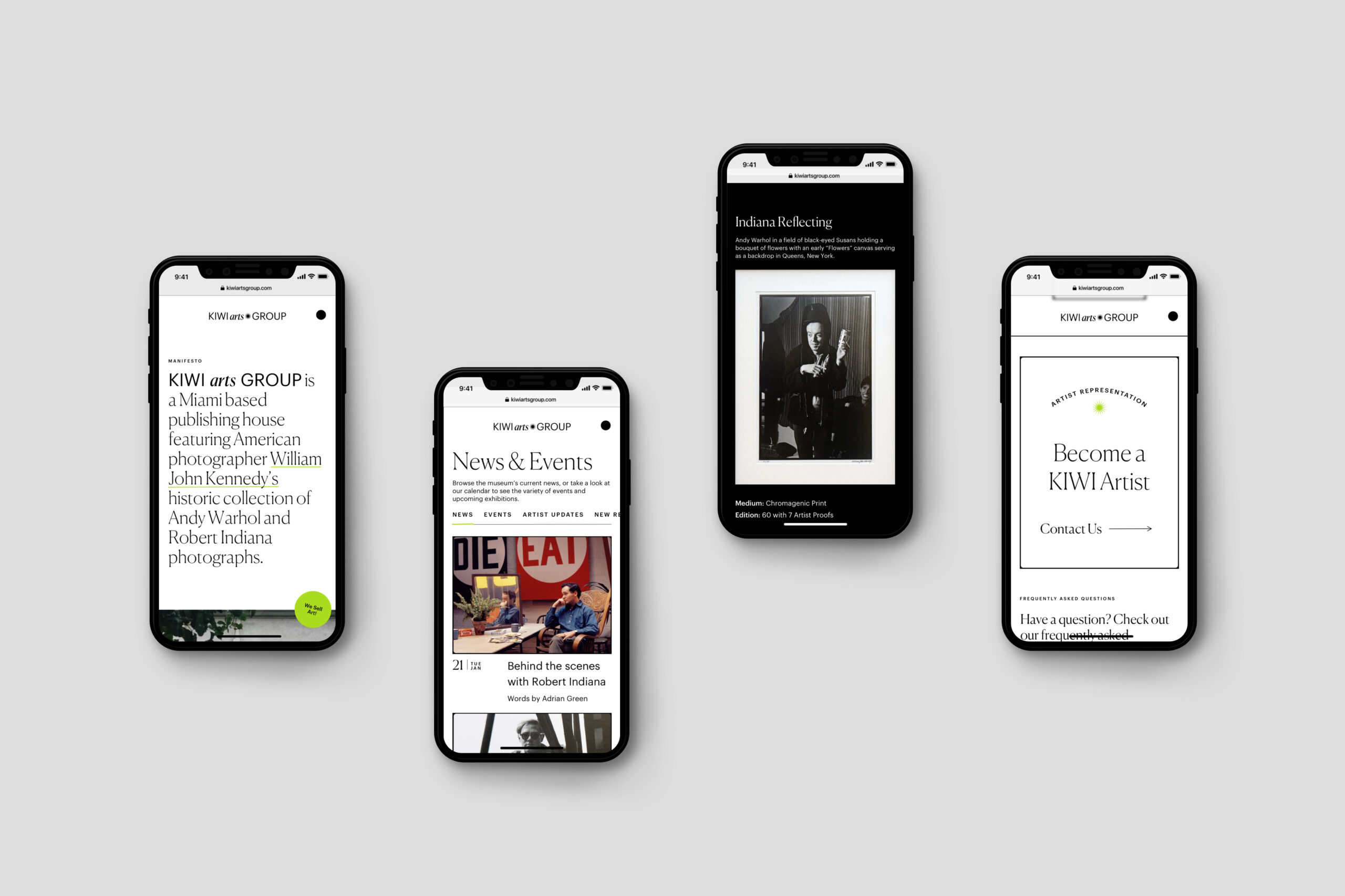
Our approach sought to reinvent the user experience considering every step of the user journey …
About KIWI:
KIWI Arts Group is a privately held art archive in Miami Florida created to house some of the world’s sweetest grails in modern art. The museum, simply referred to as “KIWI” by most, is home to a plethora of cultural mementos and hosts exhibitions that feature some of the behind the scenes looks at the Art World’s favorite’s such as Robert Kennedy, and Andy Warhol. Although based in Miami, KIWI is an international arthouse we saw massive potential in.
The Design Process:
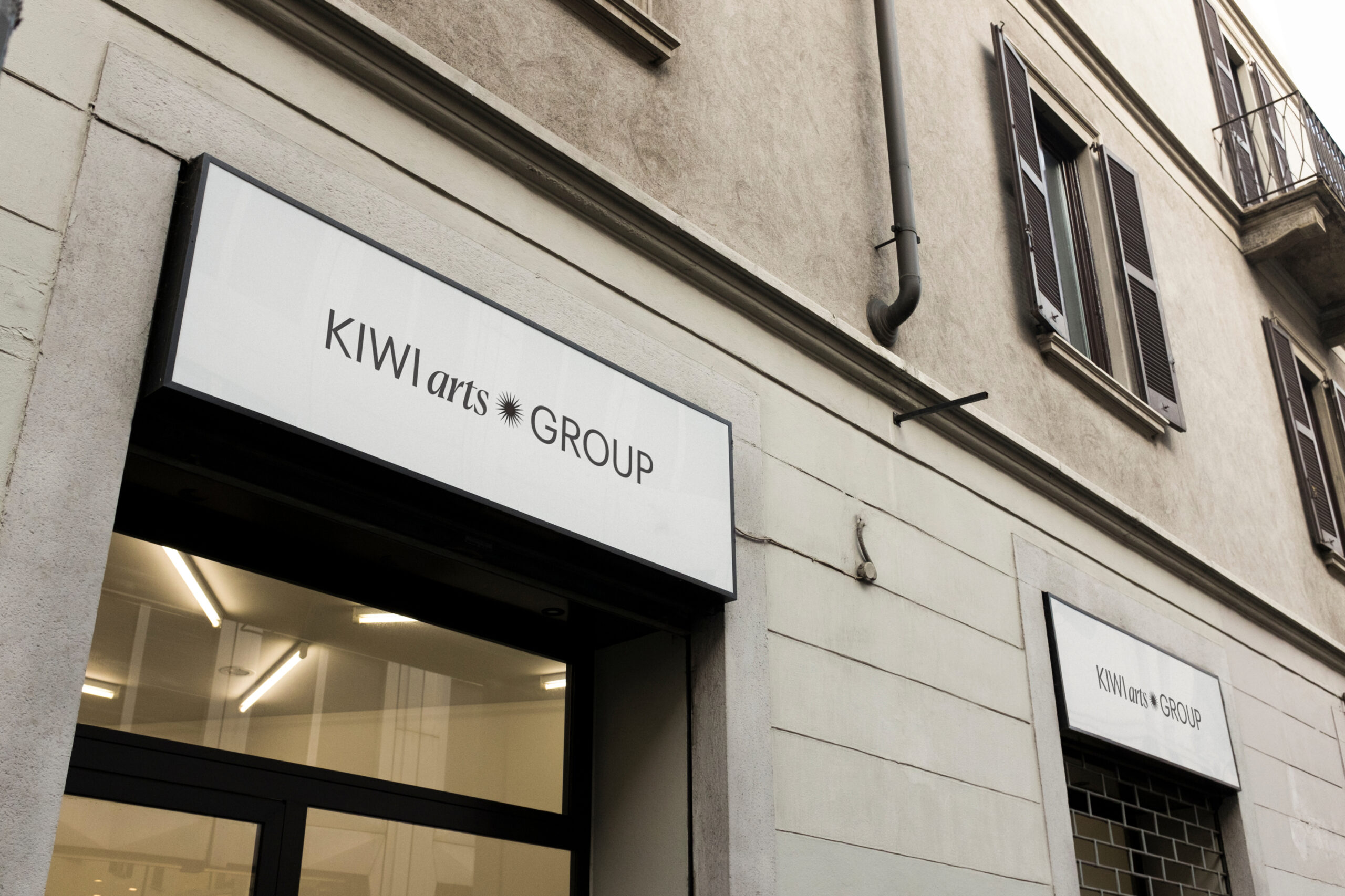
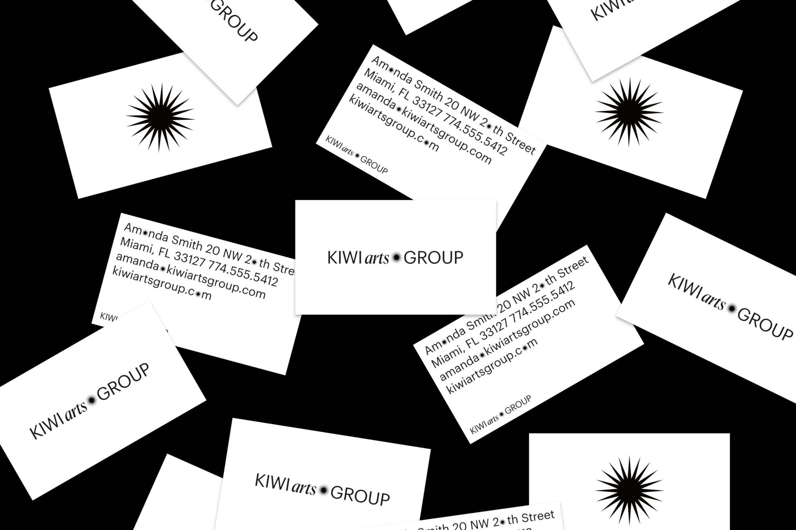
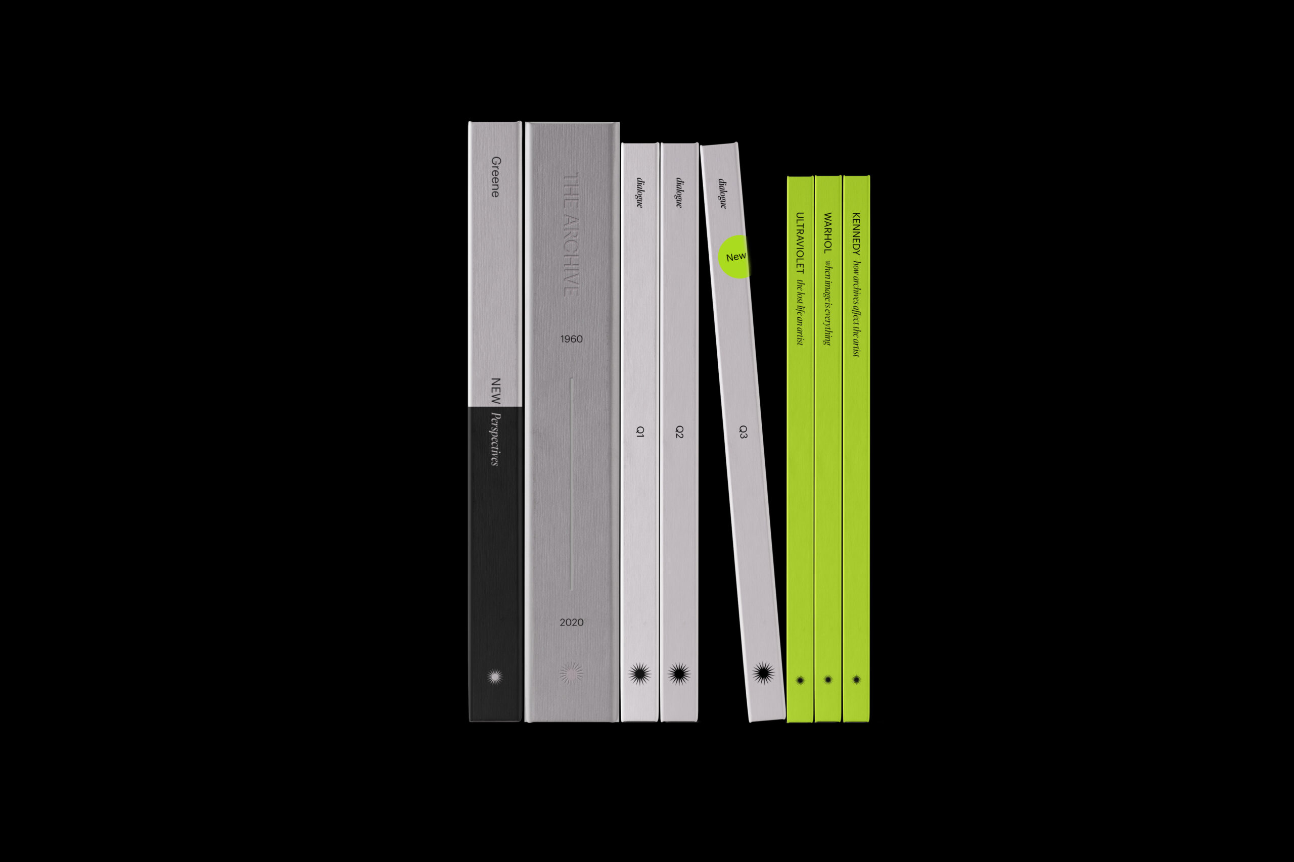
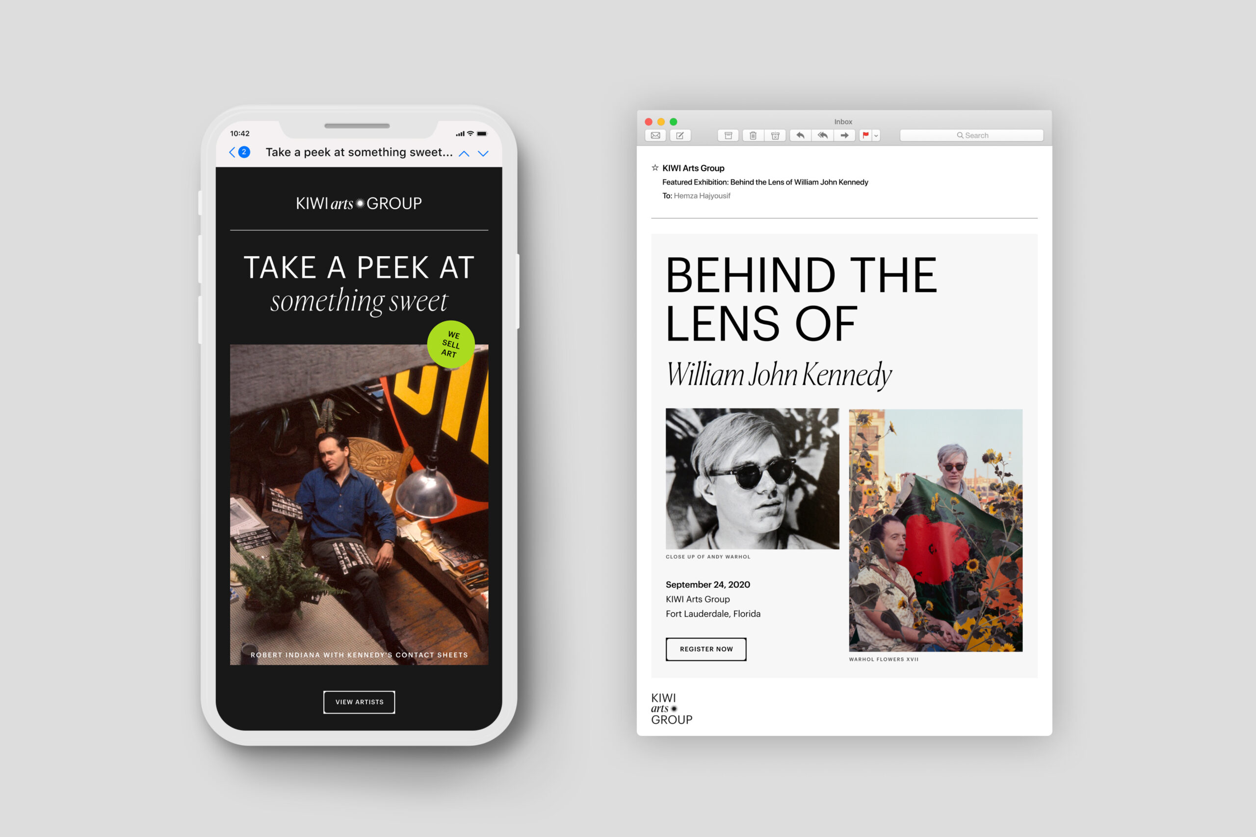
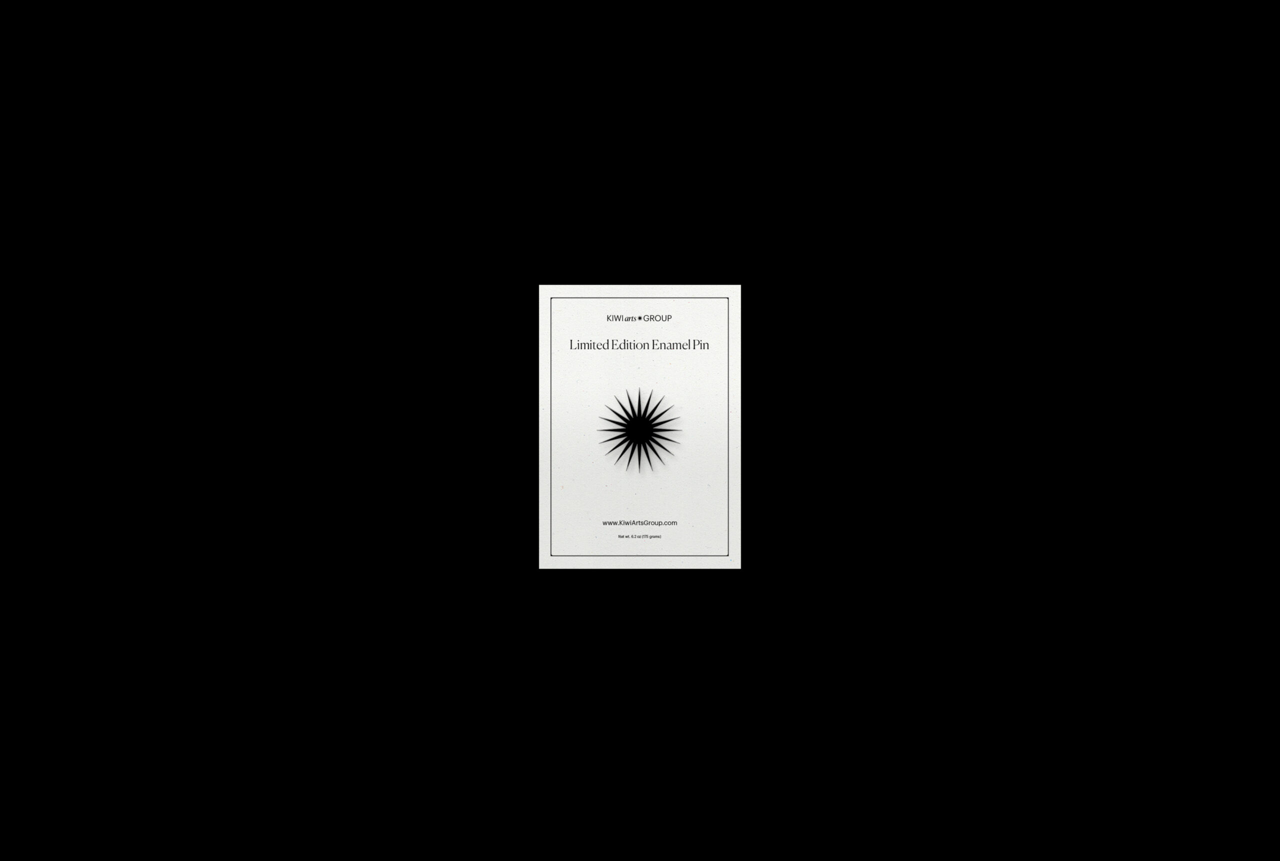
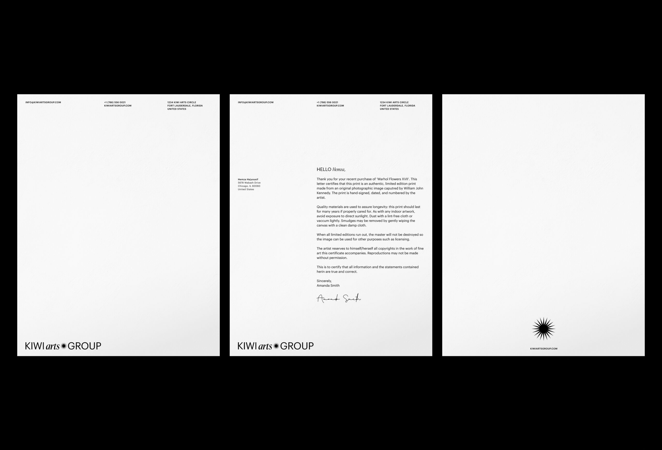
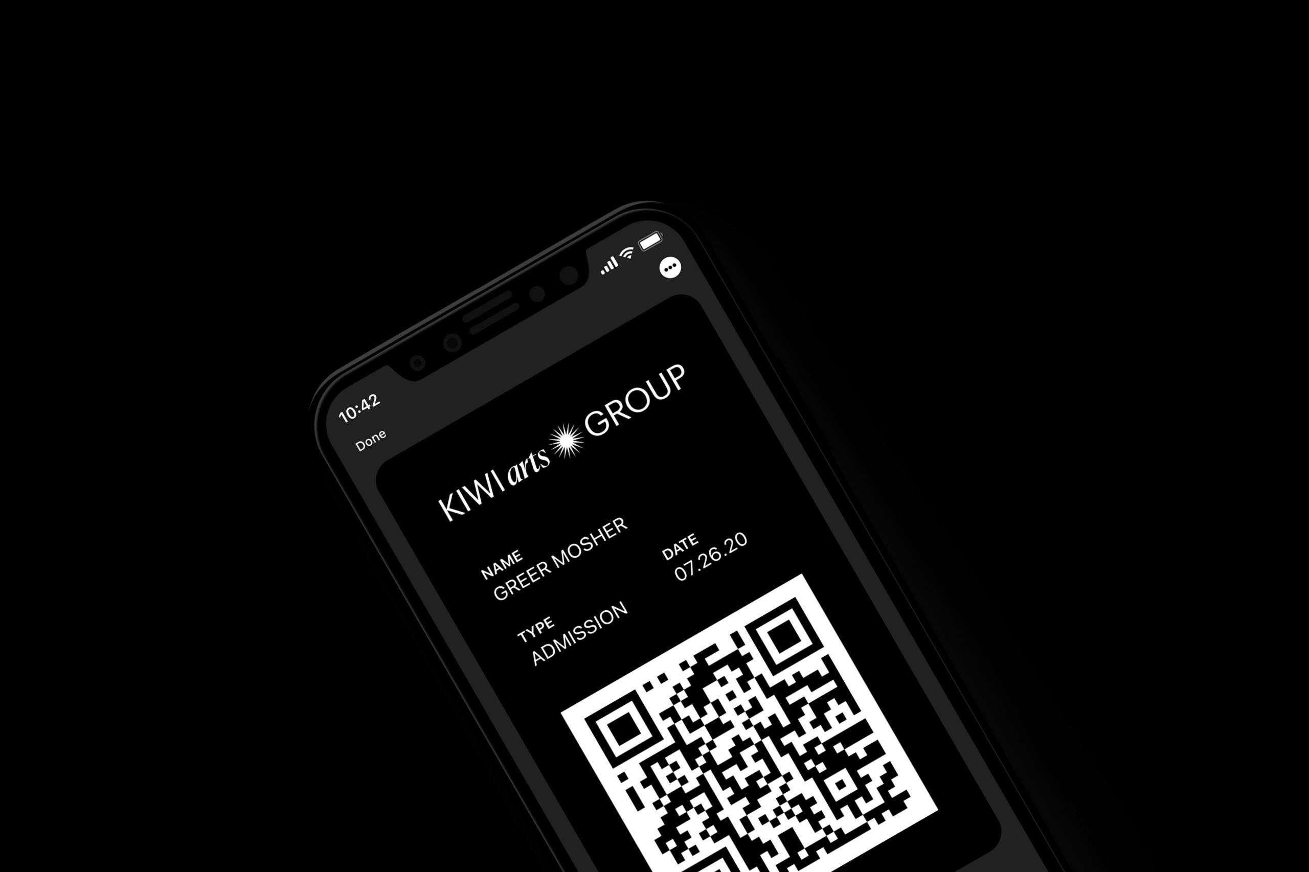
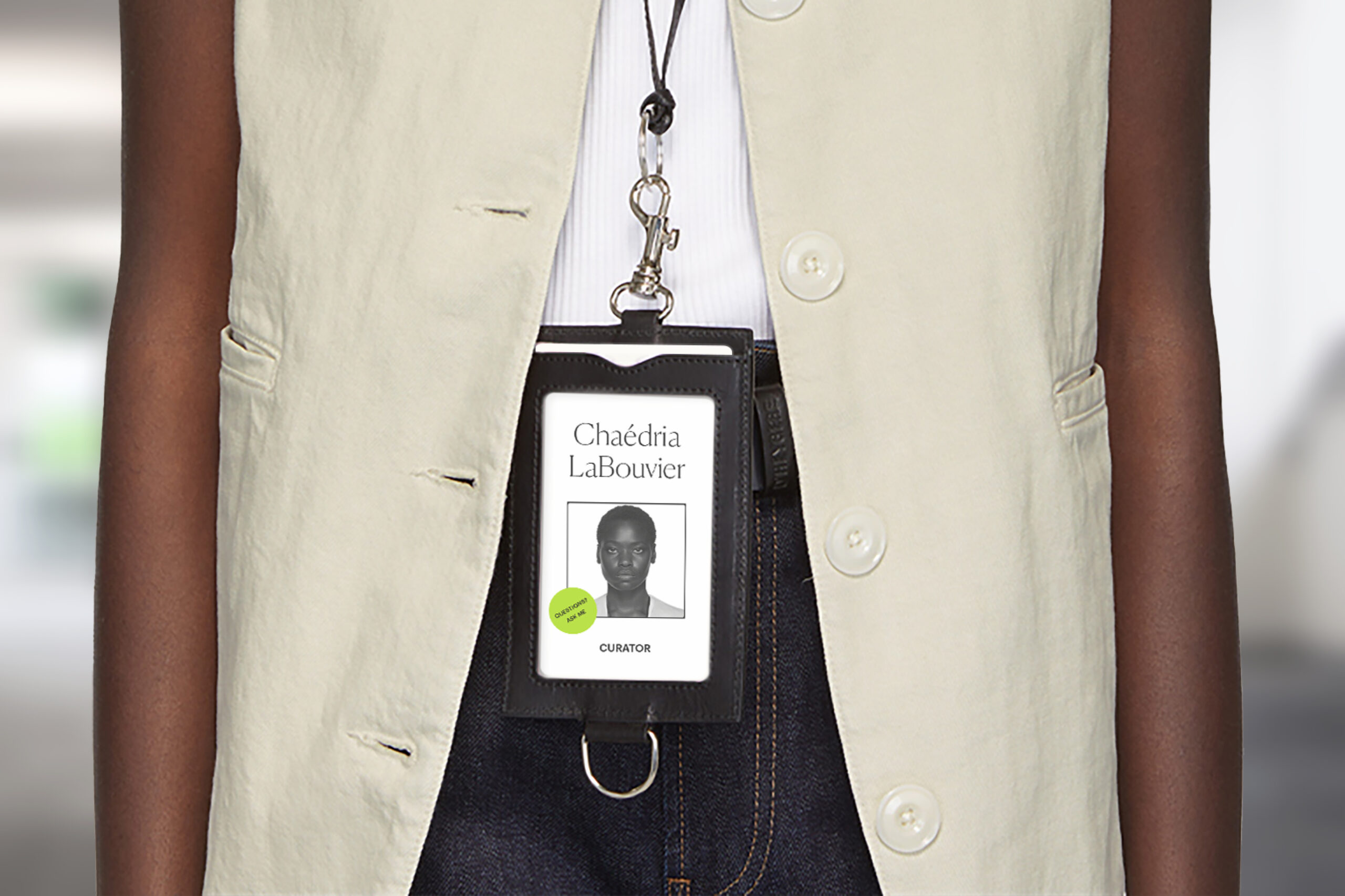
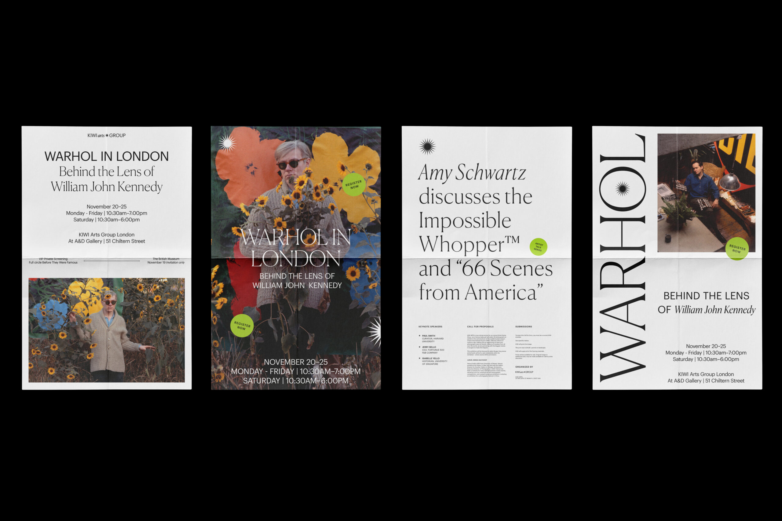
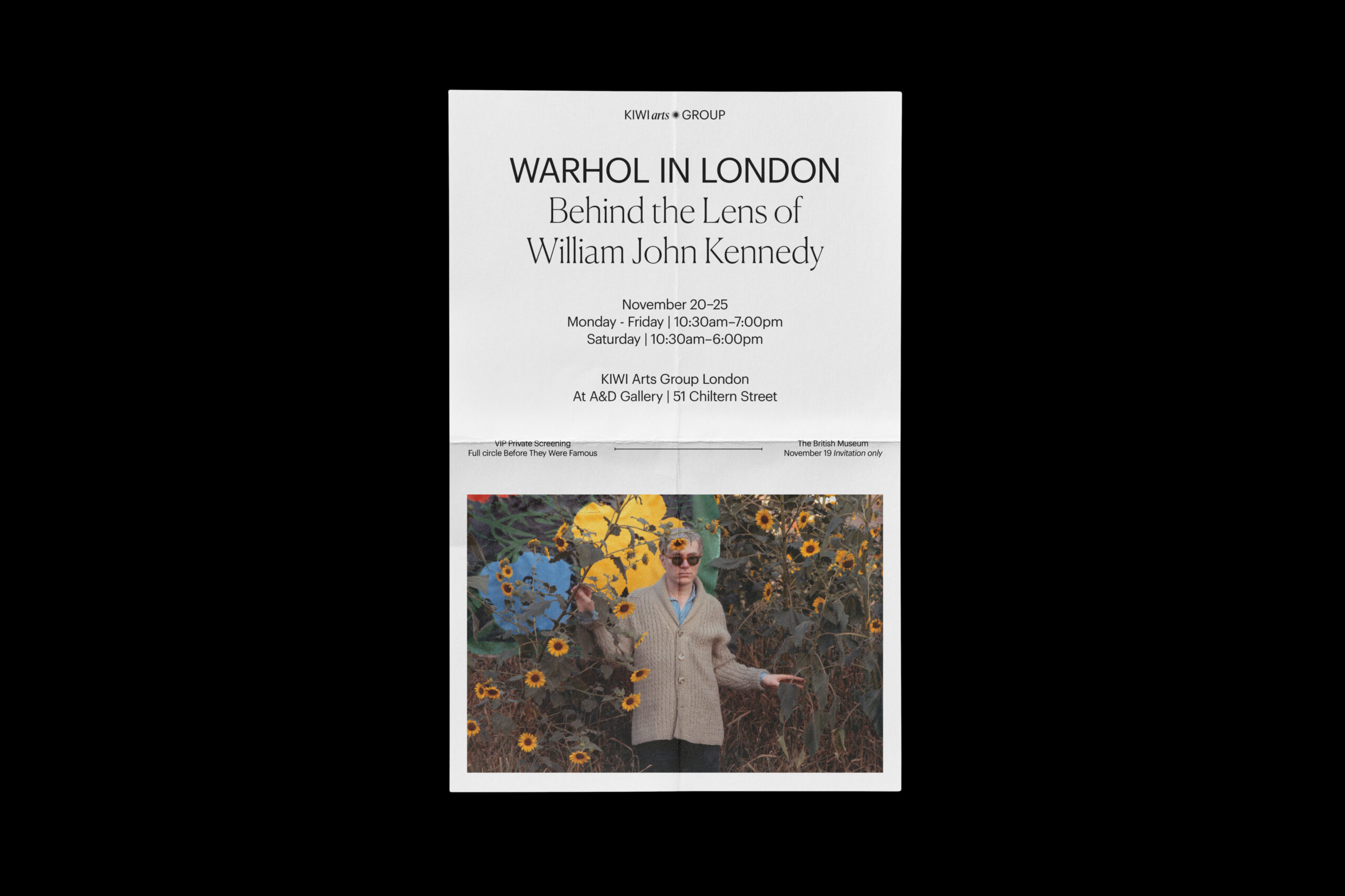
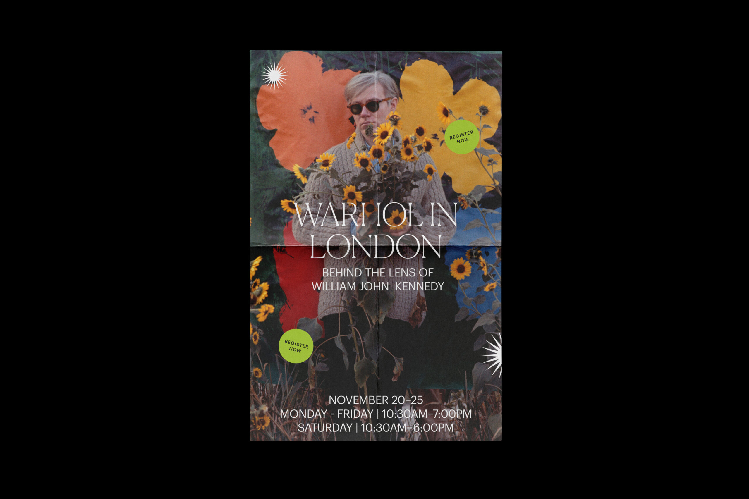
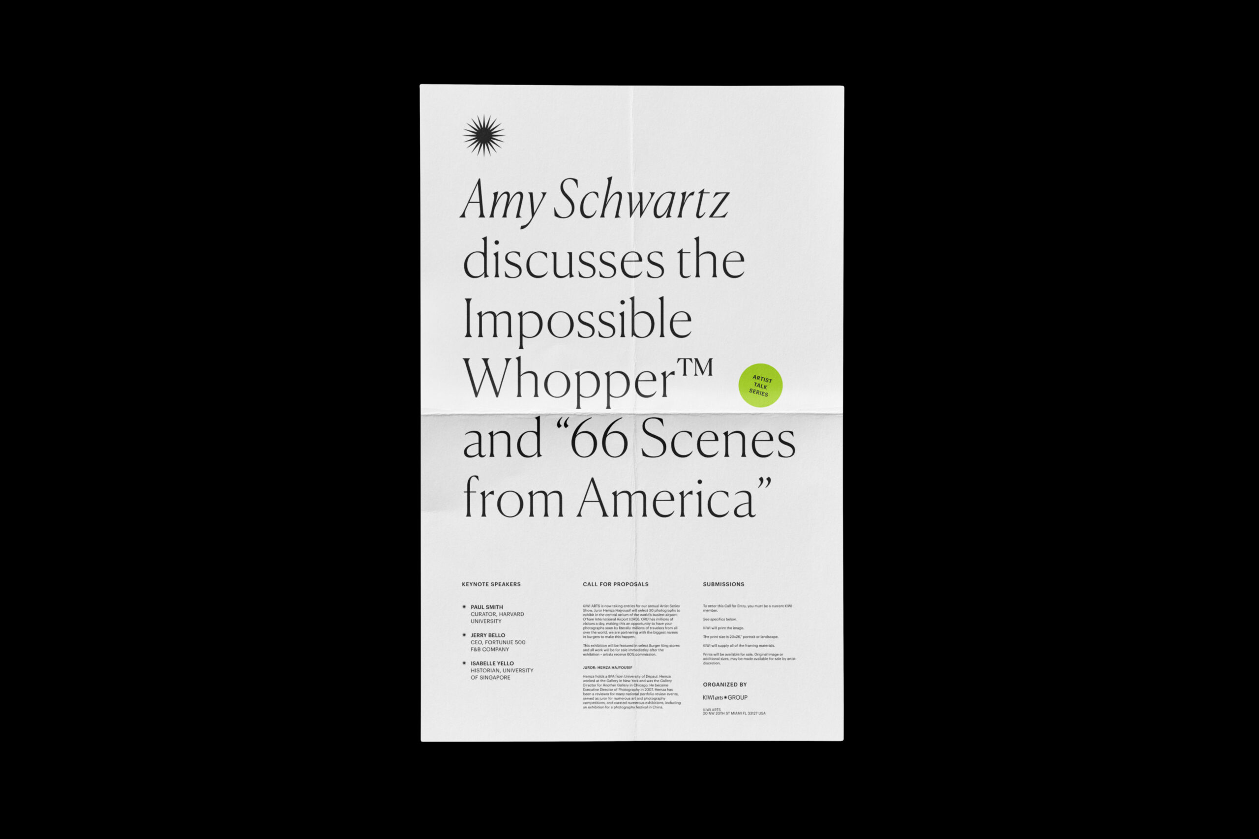
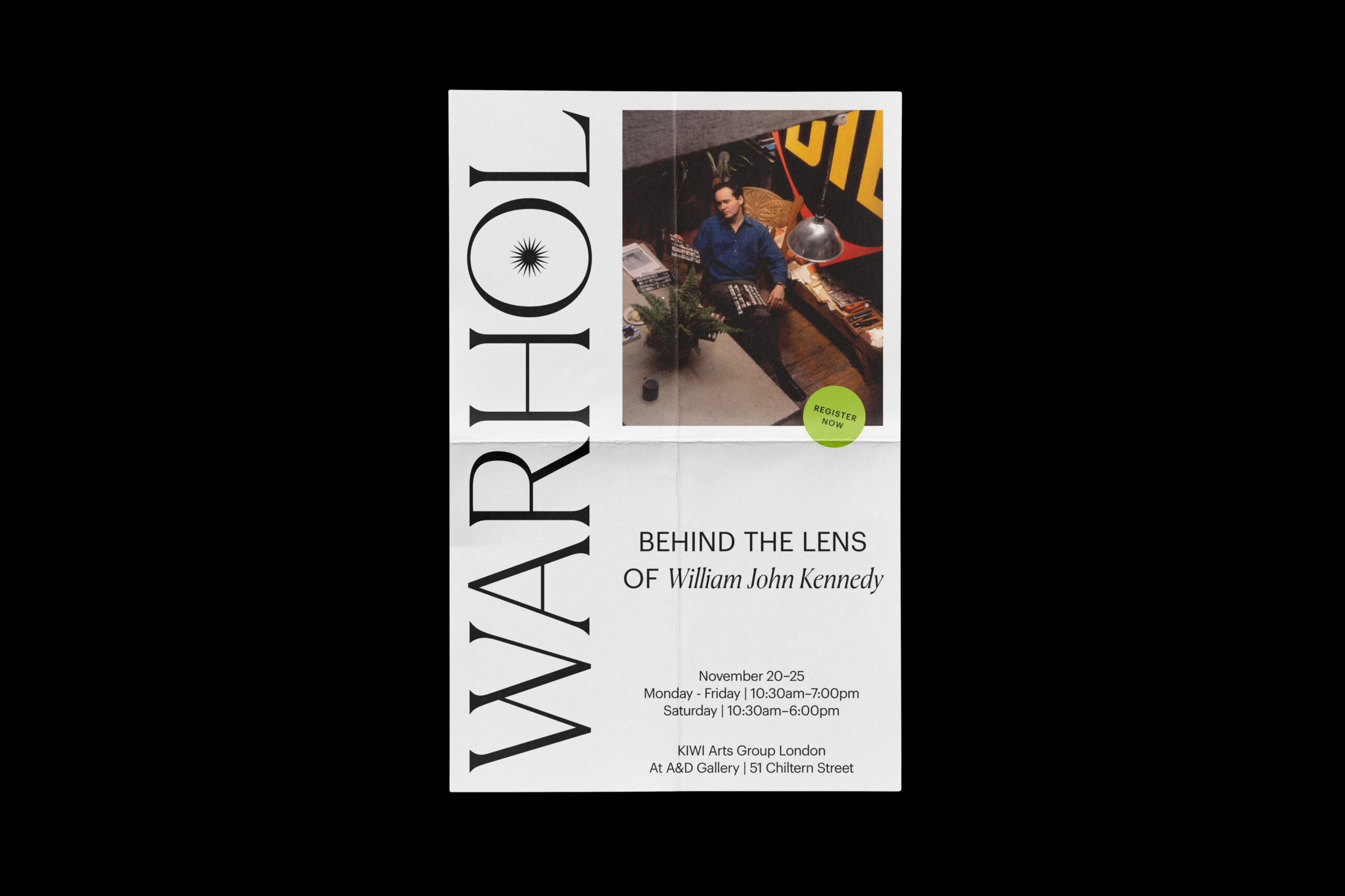
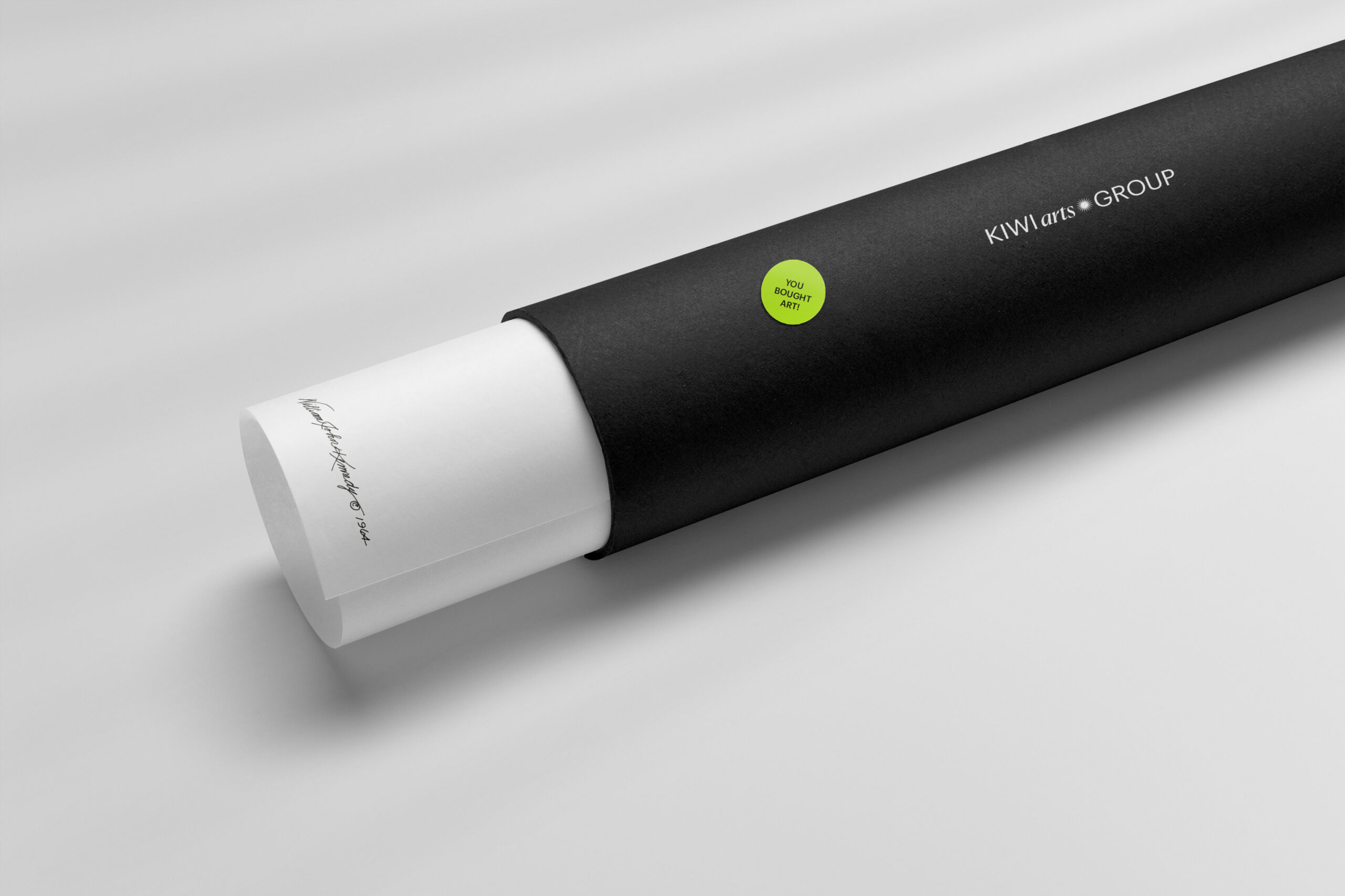
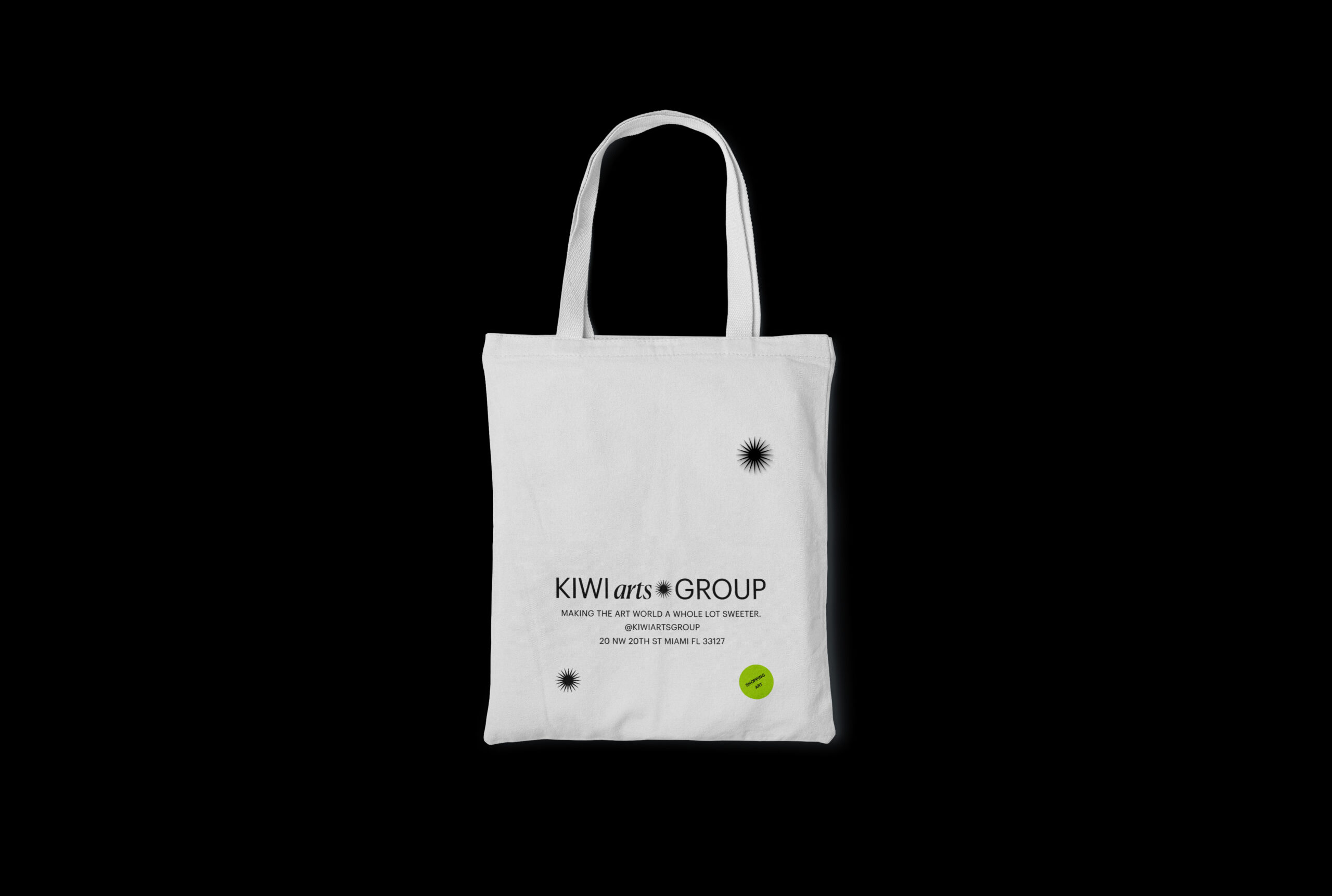
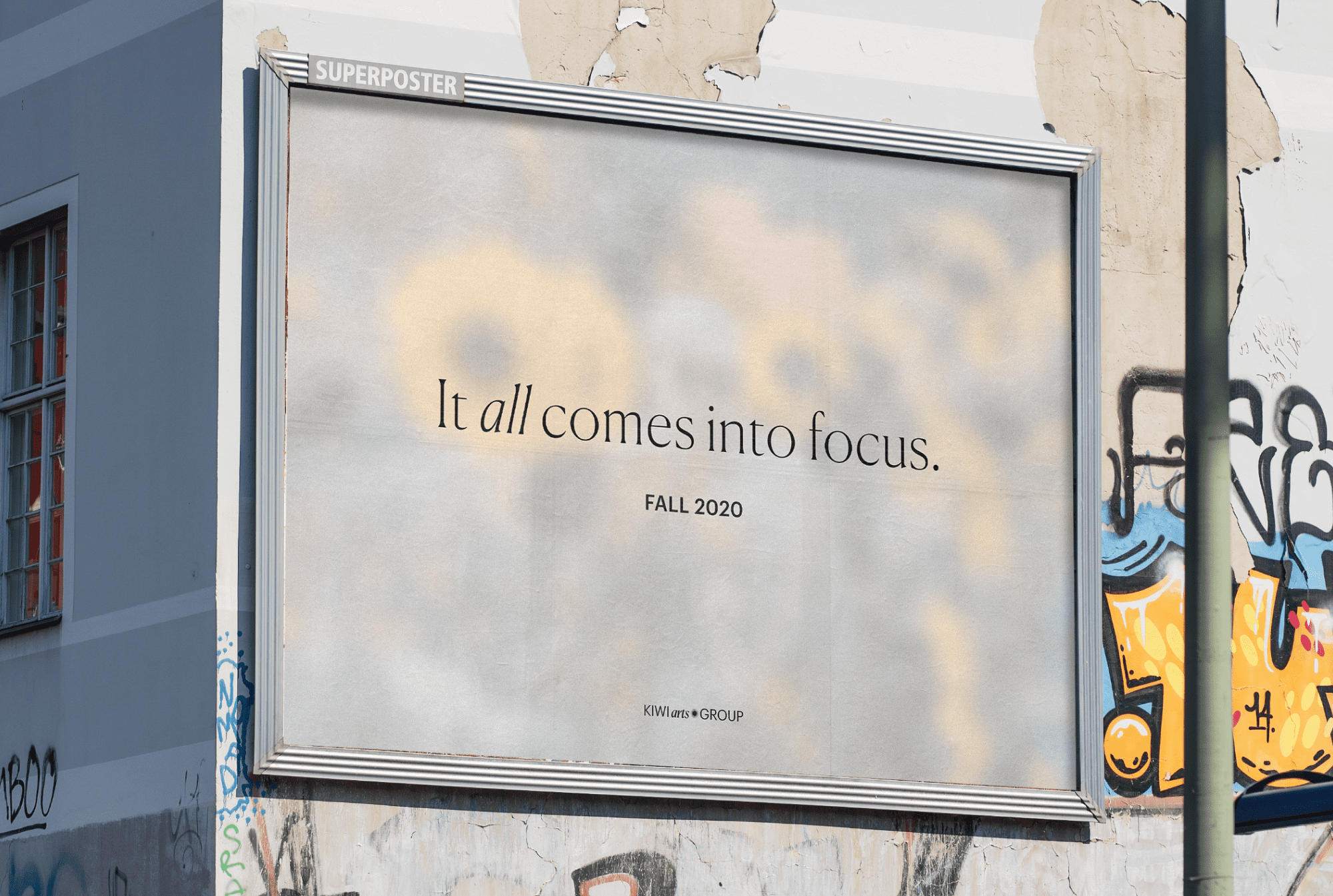
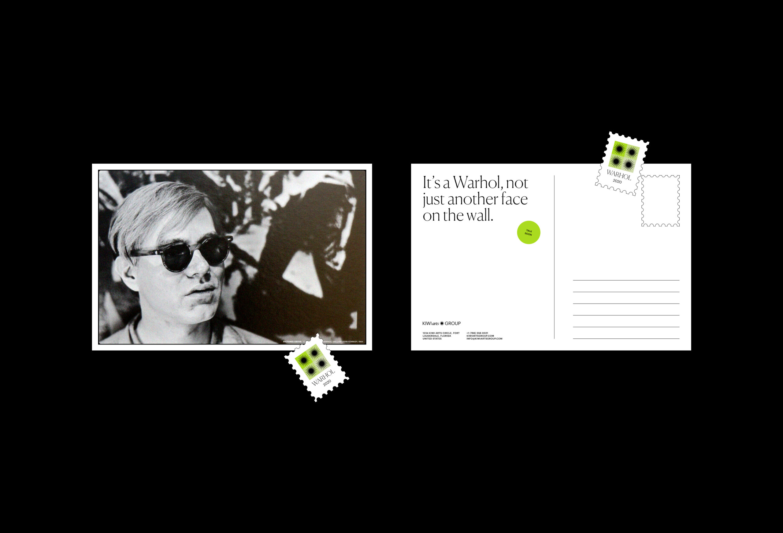
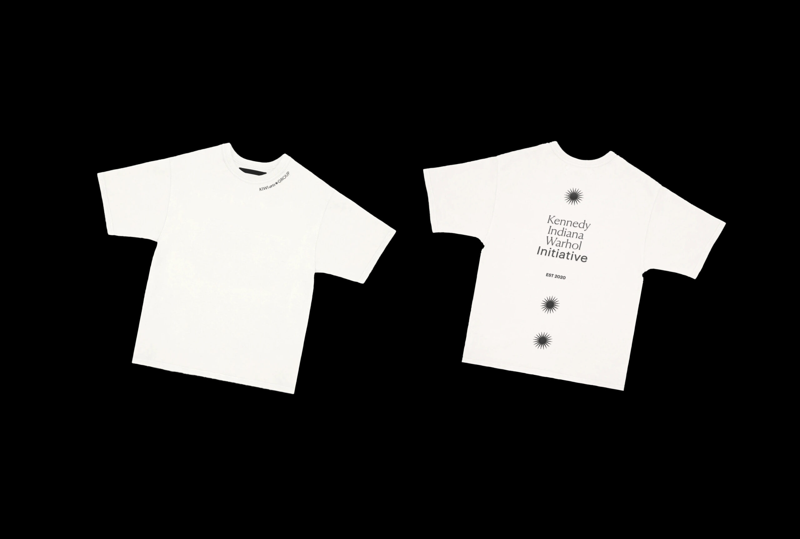
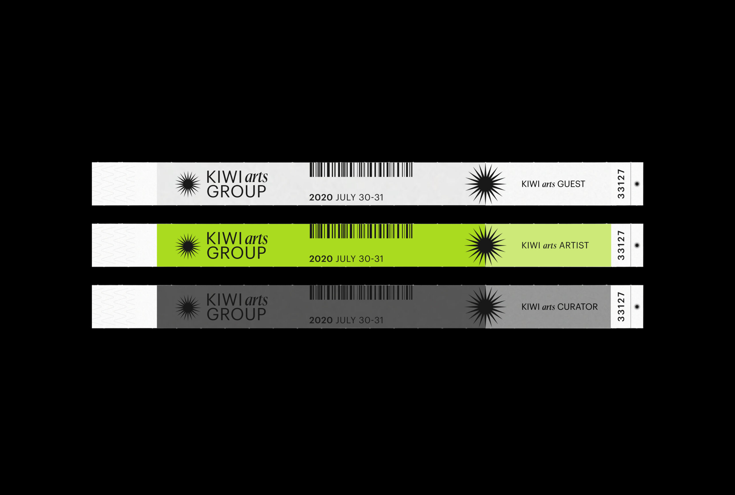
Through this project, KIWI Arts Group sought to increase its visibility in terms of visitation, and profitability as well as transforming the brand architecture to allow for collaborative growth. Through this rebranding we worked directly with curators to entirely rethink KIWI’s approach to their graphic identity. Our approach sought to reinvent the user experience considering every step of the user journey from digital and web applications, to the physical experience of collaborating with the curators and owners of the brand. Our new branding system integrates a wide breadth of touchpoints including printed materials, signage, stationery, merchandise and packaging, amongst others.
The Brand Mark:
The Sunburst is a mark we landed up naturally after investigating into the brand heritage, and explorations of the arthouse’s archives. The Sunburst’s arms reach out to emulate that of a camera’s lens flare and energy behind some of the greatest image makers. Capturing this energy and representing the luminosity of a camera flash became central to establishing the bright and youthful identity that would help us set KIWI apart.
The mark acts as a vehicle of discovery transforming in state to interact with users in novel ways, be that through cursor interactions on the web or the use of the sunburst as a sticker motif on packaging and collateral. We sought to push the visual language even further through the incorporation of a traditionalist serif typeface, Canela, juxtaposed against Graphik’s modernist forms. This contemporary type pairing creates an immediately recognizable lock-up, creating endless possibilities for typographic exploration within the art and publishing house.
Through attempting to balance the arthouse’s modernist identity and the typically serious tone of the art world, we were able to carve out a unique space in the market that pushes the bright energy of the house’s curators. Much like the juxtaposition of KIWI’s bright identity and the typical uniformity of the art world.

The BBG Team
- Greer Mosher, Art Director
- Hemza Hajyousif, Designer
